Let's Talk Book Cover Design
The received wisdom is that when you’re a debut author at a Big Five publisher, your input on the cover is minimal. You don’t have clout or experience, and the publisher will ask for feedback as a formality, but the process is out of your control. A book has to stand out in fast-scrolling feeds on tiny screens, and design is fickle and fast-changing too. It’s why a novel gets a different cover in every country that publishes it, and no one expects a first-time author to contribute much. And goddess, spare us from diva delays.
None of this was my experience. My editor, Chelcee Johns, set a meeting specifically to talk about my vision for the cover. She was explicit that my enthusiasm for the final design was essential because nobody wants the writer to shy away from showing off a cover that embarrasses them. And all along the road to its launch, a book is exposed to early feedback on Goodreads, Edelweiss, and NetGalley, where a thumbs-down rating can dampen other readers’ interest in the book. Don’t know what Edelweiss and NetGalley are? Neither did I, not really, and I’ll get to them in a sec.
It’s probably easiest to start with the bottom line up front (and with images displayed, if you’re reading this as an email message). Here’s my book cover:
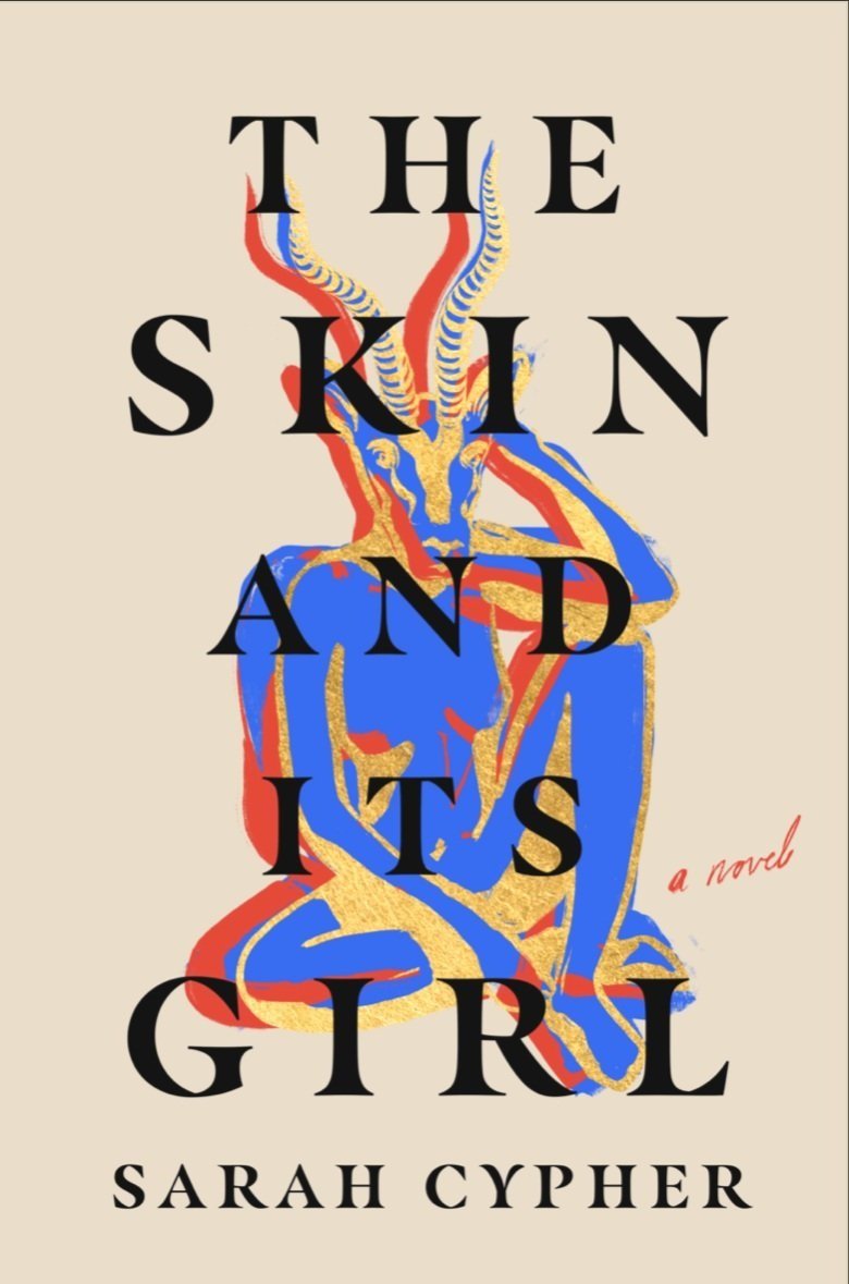
A book cover is art, but with constraints. You can still read the words. It has bright colors relevant to the story. It’s kind of weird and physical, not just in the woman’s blue skin, nudity, and come-hither pose, but she’s also got a giant gazelle head and tall squiggly horns. This all resonates with a motif in the novel, as well as the novel’s fabulist conceit of a blue-skinned narrator, and the many ways bodies assert their demands, create obstacles, and act as sites of pleasure.
It jumped out at me from the three possibilities the designer created, and we made a few refinements. For instance, the horns needed to look a little more like a gazelle’s and the face become slimmer. My name used to be larger and part of the descending vertical text, but it was also a lot harder to read. These were all comments embedded in my otherwise immensely positive feedback, which I discussed first with my agent and then shared with Chelcee. By the time the manuscript entered the copyediting stage in late May 2022, we had a final design we loved. But how did it get here and what can you learn from the process?
Enjoying this information? Read the rest at my absolutely free, non-annoying Substack, The Bird’s Eye here.